Presidential Plinko
Matthew Kay
2021-02-01
Source:vignettes/presidential_plinko.Rmd
presidential_plinko.RmdThe following code constructs a Plinko board for a quantile dotplot of a predictive distribution for the 2020 US Presidential election outcome.
See presidential-plinko.com and the mjskay/election-galton-board repository for more information.
Desired target sample
Say we want to display FiveThirtyEight’s probabilistic prediction of Biden’s chance of winning the 2020 US Presidential election. The following dataset is FiveThirtyEight’s prediction as of Oct 16, 2020:
data(pres_pred_2020, package = "plinko")

pres_pred_2020 %>%
  ggplot(aes(x = total_ev, y = evprob_chal)) +
  geom_col(fill = "gray75") +
  geom_vline(xintercept = 269) +
  coord_cartesian(xlim = c(0, 538)) +
  labs(
    x = "Electoral votes for Biden",
    y = "Predicted probability",
    title = "Predictive distribution for Biden's electoral votes",
    subtitle = "FiveThirtyEight's model of the 2020 US election as of Oct 16, 2020"
) 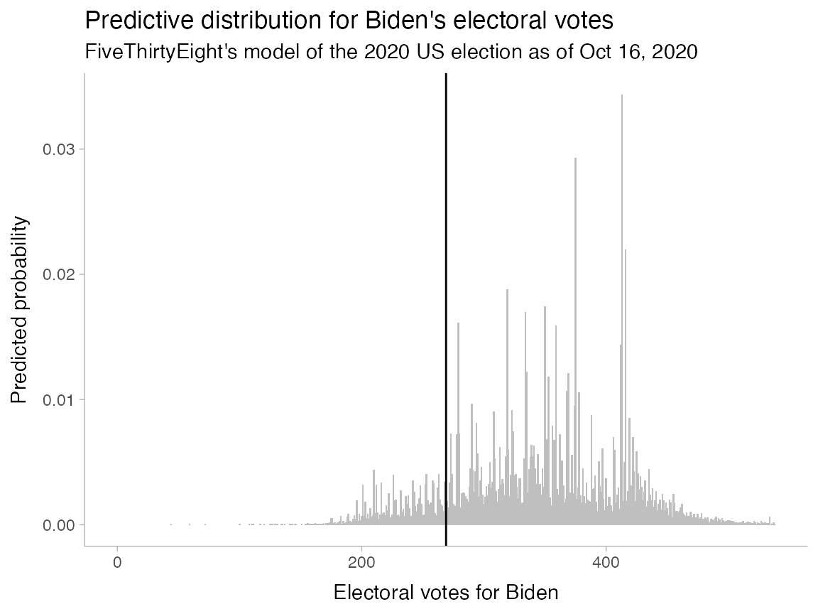
This particular dataset is already summarized as a histogram: the evprob_chal column is the probability associated with each x value (total_ev) in the above chart. While we could operate directly on this summarized data using weighted statistics (weighted means, quantiles, etc)—and this is what I did for the implementation of presidential-plinko.com—for the purposes of this example, we will convert the summarized data into a sample first. This type of data is more commonly encountered and a bit easier to work with.
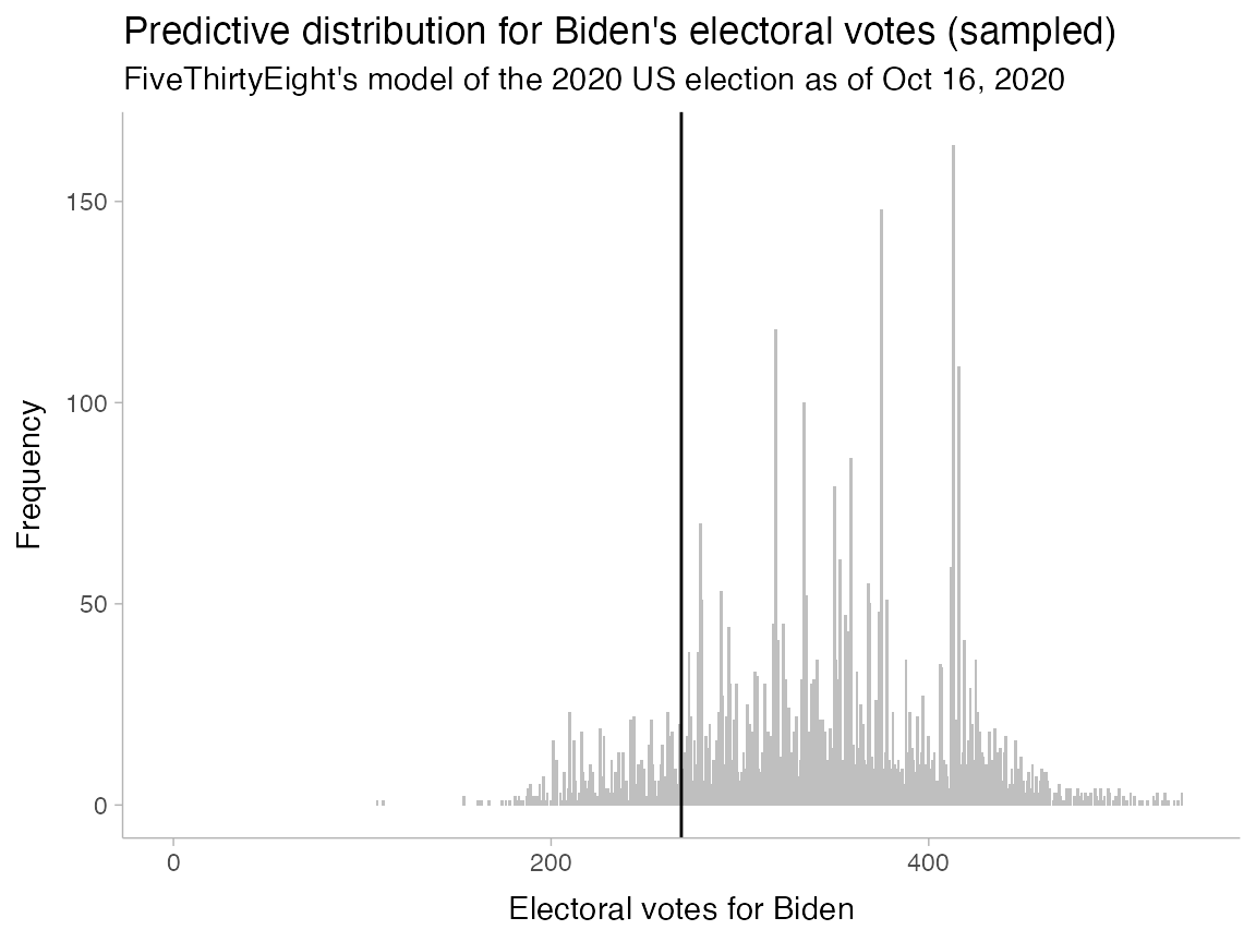
To convert the data into a sample of (say) 5000, we can just use sample() and provide the probabilities as weights:
set.seed(1234) # for reproducibility
ev_sample = sample(pres_pred_2020$total_ev, 5000, replace = TRUE, prob = pres_pred_2020$evprob_chal)
We can verify the data looks essential the same (down to sampling error):
tibble(ev_sample) %>%
  ggplot(aes(x = ev_sample)) +
  geom_histogram(binwidth = 1, fill = "gray75") +
  geom_vline(xintercept = 269) +
  coord_cartesian(xlim = c(0, 538)) +
  labs(
    x = "Electoral votes for Biden",
    y = "Frequency",
    title = "Predictive distribution for Biden's electoral votes (sampled)",
    subtitle = "FiveThirtyEight's model of the 2020 US election as of Oct 16, 2020"
) 
Constructing a basic board
The plinko_board() function can be called directly on a numeric vector; however, this usage typically requires you to already know exactly the board parameters you need (number of bins, bin width, etc). Thus, it is usally easier to call plinko_board() on a distributional object, which is an object that represents some probability distribution.
Given a distributional object and either a desired bin width (bin_width) or number of bins (n_bin), plinko_board() will do its best to automatically figure out the necessary board parameters to accomodate some number of balls from that distribution (n_ball, which by default is 50, but we will use just 20 for this example).
We can construct a distributional object from sample data using distributional::dist_sample() and pass it to plinko_board():
ev_dist = dist_sample(list(ev_sample))
board = plinko_board(ev_dist, bin_width = 35, n_ball = 20)
board
## A Plinko Board with 20 balls and 14 bins centered at 344.4096Plotting the board
Using autoplot()
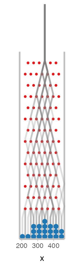
The Plinko board will automatically find random paths the balls could have taken to end up in their final locations. We can see these paths by plotting the board with the autoplot() function, which returns a ggplot() object:
board %>%
  autoplot()
## Warning in regularize.values(x, y, ties, missing(ties), na.rm = na.rm):
## collapsing to unique 'x' values## Warning: Computation failed in `stat_dist_slab()`:
## need at least two non-NA values to interpolate
By default the plot overlays the Binomial distribution implied by the Plinko board so you can judge the quality of the approximation. We can also turn this off:
board %>%
  autoplot(show_dist = FALSE)
## Warning in regularize.values(x, y, ties, missing(ties), na.rm = na.rm):
## collapsing to unique 'x' values## Warning: Computation failed in `stat_dist_slab()`:
## need at least two non-NA values to interpolate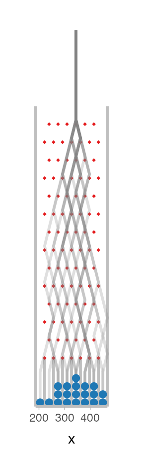
You can also see the board without paths by passing show_paths = FALSE, and you can plot specific frames of the animation by passing the frame parameter:
autoplot(board, show_paths = FALSE, frame = 9)## Warning in regularize.values(x, y, ties, missing(ties), na.rm = na.rm):
## collapsing to unique 'x' values## Warning: Computation failed in `stat_dist_slab()`:
## need at least two non-NA values to interpolate
Plotting manually
We could also create a plot like the ones above manually by using the slot_edges(), pins(), paths(), and balls() unctions, which return data frames containing the locations of all of the elements of the board:
ggplot() +
  geom_segment(aes(x = x, y = 0, xend = x, yend = height), data = slot_edges(board), color = "gray75", size = 1) +
  geom_point(aes(x, y), data = pins(board), shape = 19, color = "#e41a1c", size = 1) +
  geom_path(aes(x = x, y = y, group = ball_id), data = paths(board), alpha = 1/4, size = 1, color = "gray50") +
  geom_circle(aes(x0 = x, y0 = y, r = width/2), data = balls(board), fill = "#1f78b4", color = NA) +
  coord_fixed(expand = FALSE, clip = "off") +
  ylab(NULL) +
  scale_y_continuous(breaks = NULL) +
  theme(
    axis.line.y = element_blank(),
    axis.line.x = element_line(color = "gray75", size = 1)
) 
However, if you wish to customize the plot, it is probably easier to use the modify_layer() and add_layers() functions described later in this document, as these also impact the frames used when an animated plot is rendered.
Forcing a slot edge to fall on 269
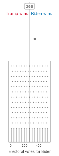
Before we get to animating this board, we also want to address an additional constraint not handled automatically above: we will want to be able to color the balls red if they fall below 269 (Trump wins) and blue if they fall above 269 (Biden wins). To do that, we need a slot edge to fall on 269.
Let’s start by seeing how well our current approximation does by turning off the display of ball paths and adding on a vertical line at 269. autoplot() returns a ggplot object so this is straightforward:
autoplot(board, show_paths = FALSE) +
  geom_vline(xintercept = 269)
## Warning in regularize.values(x, y, ties, missing(ties), na.rm = na.rm):
## collapsing to unique 'x' values## Warning: Computation failed in `stat_dist_slab()`:
## need at least two non-NA values to interpolate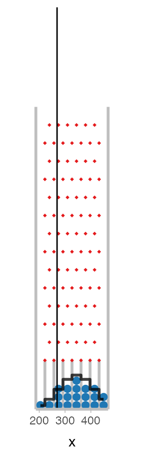
The slot edge closest to 269 is a little too far away for my taste. We can see how close it is in electoral votes:
## [1] 12.0904A simple approach to fixing this problem might be to take a range of bin sizes we are happy with (say 35 to 45 electoral votes) and find a bin width in that range that minimizes the above number:
closest_edge_to_269 = Vectorize(function(bin_width) {
  board = plinko_board(ev_dist, bin_width = bin_width)
  min(abs(board$slot_edges - 269))
})

bin_width = (35:45)[which.min(closest_edge_to_269(35:45))]
bin_width
## [1] 37Let’s see how the board looks with 37 bins:
board = plinko_board(ev_dist, bin_width = bin_width, n_ball = 20)

autoplot(board, show_paths = FALSE) +
  geom_vline(xintercept = 269)
## Warning in regularize.values(x, y, ties, missing(ties), na.rm = na.rm):
## collapsing to unique 'x' values## Warning: Computation failed in `stat_dist_slab()`:
## need at least two non-NA values to interpolate
That looks pretty good! If we want to get really persnickety about it, we are still off by a little over 1 electoral vote:
closest_edge_to_269(bin_width)## [1] 1.4096We could fix that by shifting the center of the board slightly to compensate. To do that we need to know the signed difference between the slot edge closest to 269 and 269:
## [1] -1.4096Then we can use this to shift the board center slightly
shifted_center = board$center + slot_edge_shift
board = plinko_board(ev_dist, bin_width = bin_width, n_ball = 20, center = shifted_center)

autoplot(board, show_paths = FALSE) +
  geom_vline(xintercept = 269)
## Warning in regularize.values(x, y, ties, missing(ties), na.rm = na.rm):
## collapsing to unique 'x' values## Warning: Computation failed in `stat_dist_slab()`:
## need at least two non-NA values to interpolate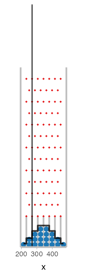
Customizing board appearance
Now that our board has the parameters we want—a distribution that matches our target distribution and a slot edge falling on 269—we can customize the rest of the appearance of the board.
Adjusting limits
First, we can adjust the limits of the board using the limits parameter. For this use case we should show the distribution compared to the full range of possible electoral votes:
board = plinko_board(ev_dist, bin_width = bin_width, n_ball = 20, center = shifted_center, limits = c(0, 538))

autoplot(board)
## Warning in regularize.values(x, y, ties, missing(ties), na.rm = na.rm):
## collapsing to unique 'x' values## Warning: Computation failed in `stat_dist_slab()`:
## need at least two non-NA values to interpolate
Customizing ggplot layers
We can also customize existing layers in the ggplot objects generated for each frame using the modify_layer() function, which takes a layer name followed by parameters you would normally pass to a ggplot layer/geom. Aesthetic mappings you provide are merged with the existing aesthetics in the layer, and new arguments you provide override existing ones.
For example, say you want to make the ball fill color depend on its x position, and change the outline color to be black:
board %>%
  modify_layer("balls", aes(fill = x), color = "black") %>%
  autoplot(show_dist = FALSE)
## Warning in regularize.values(x, y, ties, missing(ties), na.rm = na.rm):
## collapsing to unique 'x' values## Warning: Computation failed in `stat_dist_slab()`:
## need at least two non-NA values to interpolate
You can use modify_layer() to adjust the following layers:
- “slot_edges”: A
geom_segment()that draws the edges of the slots - “pins”: A
geom_point()that draws the pins - “paths”: A
geom_path()that draws ball paths - “balls”: A
geom_circle()that draws the balls - “dist”: A
geom_step()that draws the reference binomial distribution
When plotting a single frame, you can also add additional ggplot objects after the call to autoplot(), as with any ggplot object:
board %>%
  autoplot(show_dist = FALSE, show_paths = FALSE) +
  geom_vline(xintercept = 269, color = "black", alpha = 0.15, size = 1) +
  annotate("label", x = 269, y = 1500, label = "269", hjust = 0.5, color = "gray50")
## Warning in regularize.values(x, y, ties, missing(ties), na.rm = na.rm):
## collapsing to unique 'x' values## Warning: Computation failed in `stat_dist_slab()`:
## need at least two non-NA values to interpolate
However, layers added in this way are not saved into the board object, and so will not be displayed when the board is animated.
To add ggplot objects to the board object so that they are displayed when the board is animated, you must use the add_layers() function before calling autoplot() or animate(). Here is the same example using add_layers():
board %>%
  add_layers(
    geom_vline(xintercept = 269, color = "black", alpha = 0.15, size = 1),
    annotate("label", x = 269, y = 1500, label = "269", hjust = 0.5, color = "gray50")
  ) %>%
  autoplot(show_dist = FALSE, show_paths = FALSE, show_target_dist = FALSE)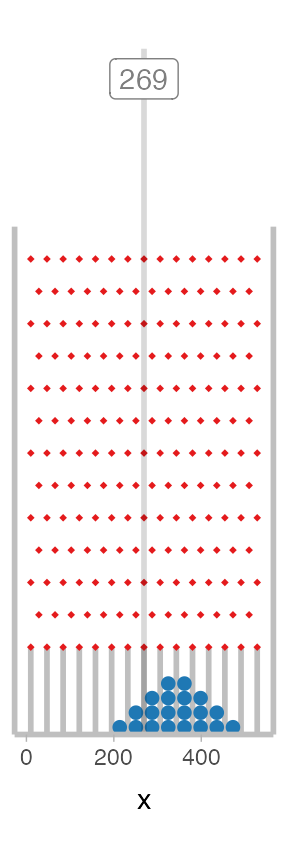
As static plots, both look identical. However, when we get to animating (next), we’ll have to use the add_layers() approach.
Animating the board
By default, no tweening is done between balls on the board:
board %>%
  # width is determined automatically based on height
  animate(fps = 7.5, height = 450)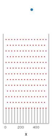
Most likely you will want some tweening between ball states. I find that using 4 times the base number of frames with a "bounce-out" easing function (the default) makes for a smooth animation that feels more physically accurate. You can add tweening using the tween_balls() function. You’ll also want to increase the fps to account for the additional frames, and we will add a 3-second (90-frame) pause at the end of the animation using end_pause:
board %>%
  tween_balls(frame_mult = 4, ease = "bounce-out") %>%
  animate(fps = 30, height = 450, end_pause = 90)
Given the increased number of frames due to tweening, you may want to increase speed by rendering frames in parallel using the cores argument to animate.plinko_board(). The cores argument defaults to getOptions("cores", 1), so if you want to set the number of cores to the total number available for all subsequent calls to animate.plinko_board(), you can also use:
options(cores = parallel::detectCores())For testing purposes (e.g. faster rendering), it can also be useful to filter the frames in the final animation. You can do this using filter_frames(), which takes filtering conditions in the same format as filter() and applies them to the data frame returned by frames(board). The "ball_id" column can be combined with the "stopped" column (which is TRUE after the ball hits the bottom of a slot and stops moving) to show just one ball dropping, for example:
board %>%
  filter_frames(ball_id == 1, !stopped) %>%
  tween_balls(frame_mult = 4, ease = "bounce-out") %>%
  animate(fps = 30, height = 450)
A full, annotated board
Finally, we can combine everything together to adjust the existing geometries with modify_layer(), add annotations with add_layers(), add tweening with tween_balls(), then animate:
Biden_color = "#0571b0"
Trump_color = "#ca0020"

annotation_height = 2000

board %>%
  modify_layer("pins", color = "gray50") %>%
  # the "balls" layer uses the frame(board) data frame, which has a "region"
  # column giving the part of the board the ball is in ("start", "pin", or "slot")
  # we can use this to change the ball color when it falls into the slot
  modify_layer(
    "balls",
    aes(fill = ifelse(region == "slot", ifelse(x <= 269, "Trump", "Biden"), "none")),
    color = NA
  ) %>%
  add_layers(
    geom_vline(xintercept = 269, color = "black", alpha = 0.15, size = 1),
    annotate("text",
      x = 290, y = 0.92 * annotation_height,
      label = "Biden wins", hjust = 0, color = Biden_color,
    ),
    annotate("text",
      x = 250, y = 0.92 * annotation_height,
      label = "Trump wins", hjust = 1, color = Trump_color
    ),
    annotate("label",
      x = 269, y = 0.97 * annotation_height,
      label = "269", hjust = 0.5, color = "gray50",
      fontface = "bold"
    ),
    expand_limits(y = annotation_height),
    scale_fill_manual(
      limits = c("none", "Biden", "Trump"),
      values = c("gray45", Biden_color, Trump_color),
      guide = FALSE
    ),
    theme(axis.title.x = element_text(hjust = 0, size = 10, color = "gray25")),
    xlab("Electoral votes for Biden")
  ) %>%
  tween_balls(frame_mult = 4, ease = "bounce-out") %>%
  animate(fps = 30, height = 550, end_pause = 90)